JobsToday is a dedicated job-search service designed to assist first-generation immigrants. Primary user demographic falls within the age range of 18-55, with the majority being adults who are not native speakers of the local language.
First-generation immigrants require a convenient platform where they can effortlessly conduct job searches, whether on the go or at a support center, without added stress.
Design a user-friendly website that caters to both mobile and desktop platforms, offering a seamless job-search experience coupled with easy access to supplementary information.
UX designer (generalist) designing website from conception to delivery.
Conducting interviews, paper and digital wireframing, low and high fidelity prototyping, conducting usability studies, accounting for accessibility, iterating on designs and responsive design.
I conducted interviews and created empathy maps to understand users I’m designing for and their needs. A primary user group identified from the research was first-generation immigrants without a job. This group confirmed assumptions about the main service user.
Another group comprises students who have arrived in Sweden for educational purposes, seeking opportunities for seasonal or part-time employment to supplement their income and gain valuable work experience during their academic journey.
Time is frequently a significant factor, particularly for individuals juggling academic commitments and the various tasks associated with the immigration process.
An additional layer of stress is introduced by the presence of a language barrier and the emotional weight experienced by individuals who find themselves in a foreign land, away from their homeland.
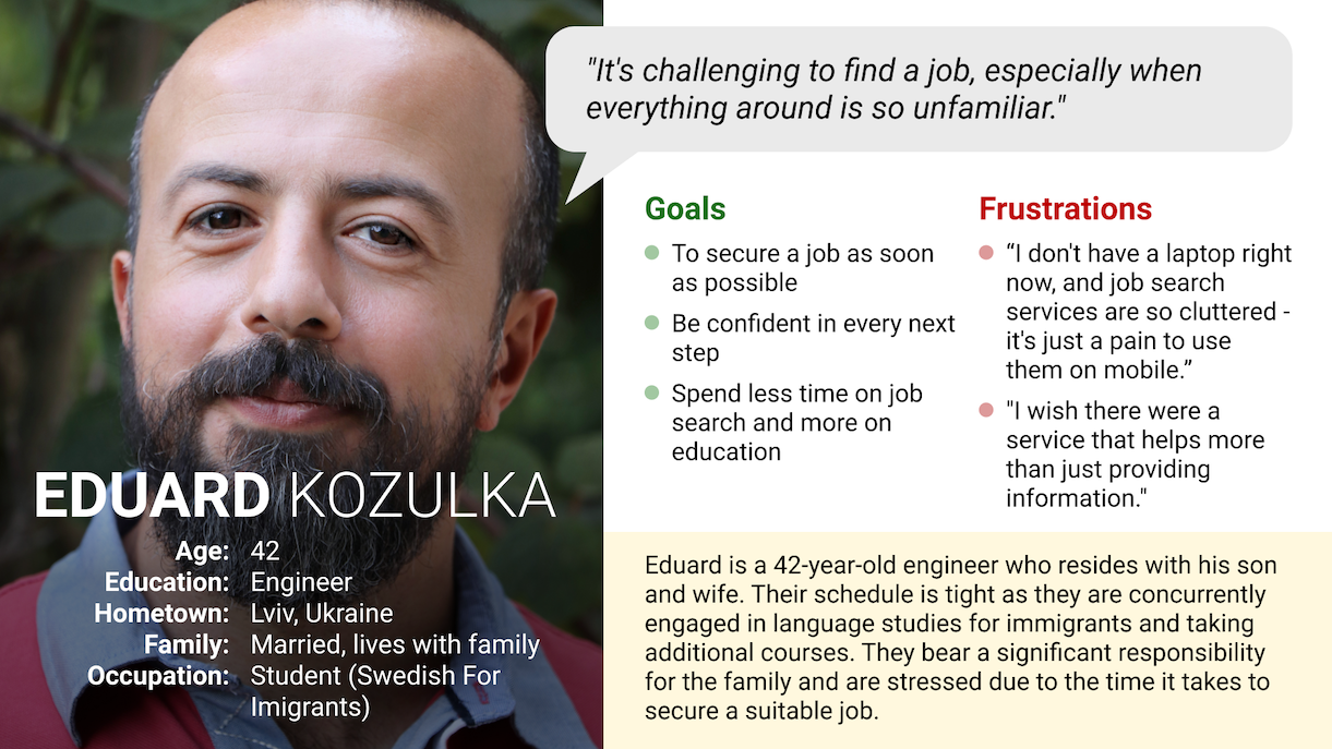
Eduard, a first-generation immigrant, engineer, and father, seeks a job swiftly and with minimal stress, aiming to spend the least possible time on the search process.
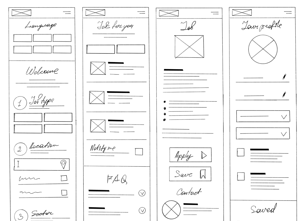
Next, I drafted paper wireframes for each screen, taking into consideration user pain points related to navigation, browsing, and the checkout flow.
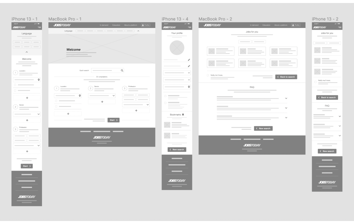
Given that JOBSTODAY users utilize the app on various devices, I initially focused on mobile design and extended my efforts to create designs for additional screen sizes, ensuring full responsiveness.
Transitioning from paper to digital wireframes facilitated a clear understanding of how the redesign could address user pain points and enhance the overall user experience.
A crucial aspect of my strategy involved prioritizing optimal button locations and visual element placement on the home page.
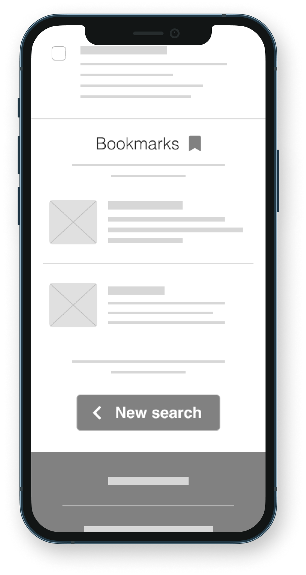
To prepare for usability testing, I created a low-fidelity prototype that linked the user flow, encompassing three simple steps for initiating a search and saving or removing an item in a bookmarks panel.
Lo-fi prototype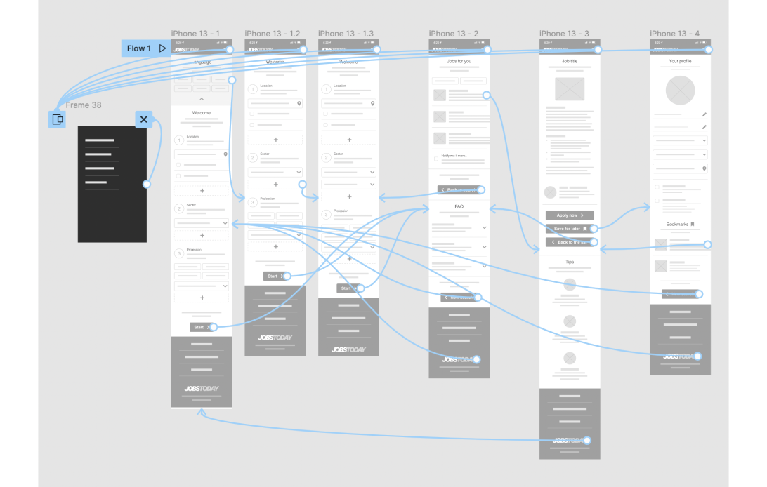
Unmoderated usability study
Sweden, Stokholm, remote
7 participants
20-30 minutes
These were the main findings uncovered by the usability study:
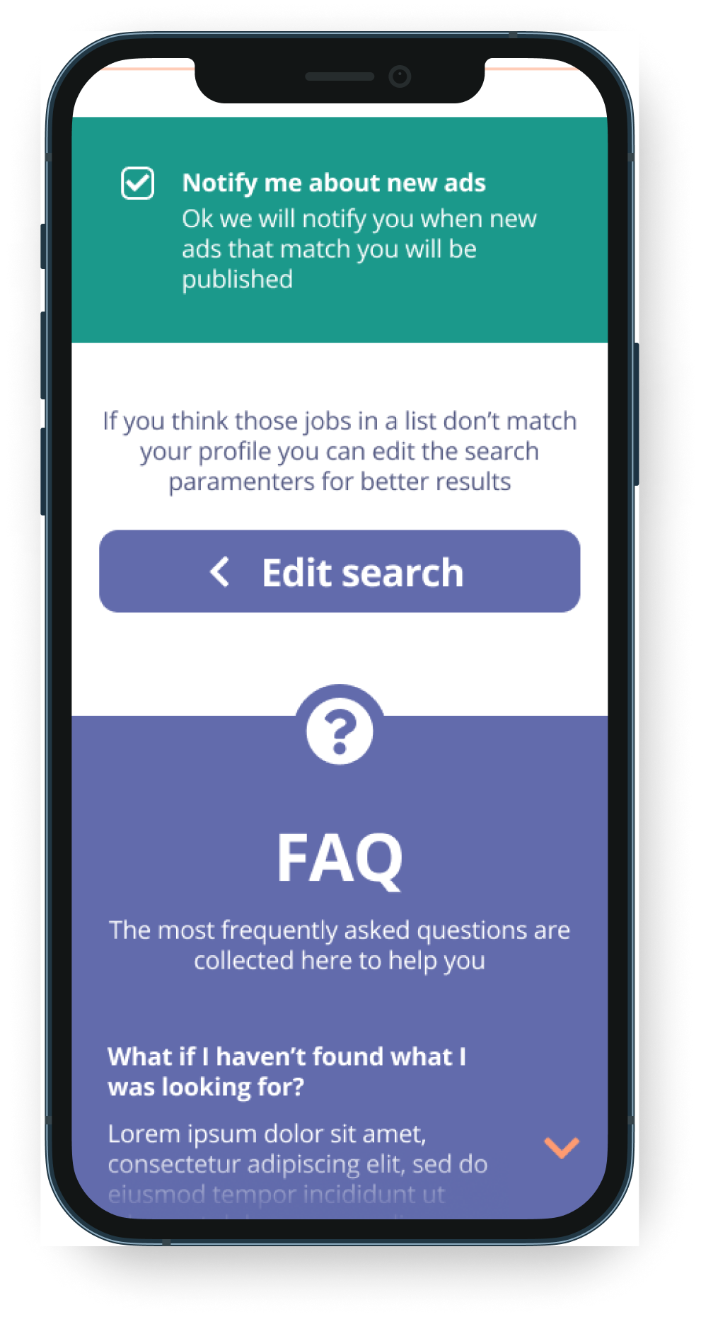
Alongside the three simple steps, users lack a general quick/single-input search option
Users suggest reviewing the order of the three-step input, starting with Location
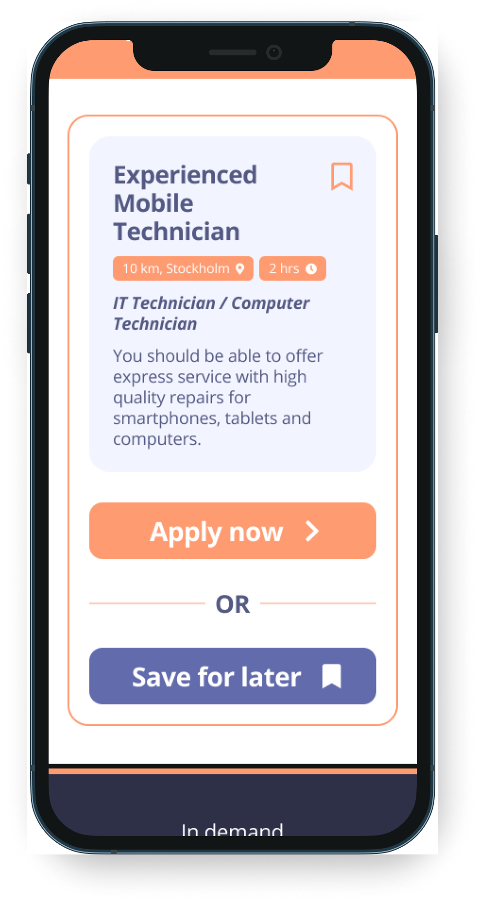
Users were confused about why bookmarks are only a part of the profile page
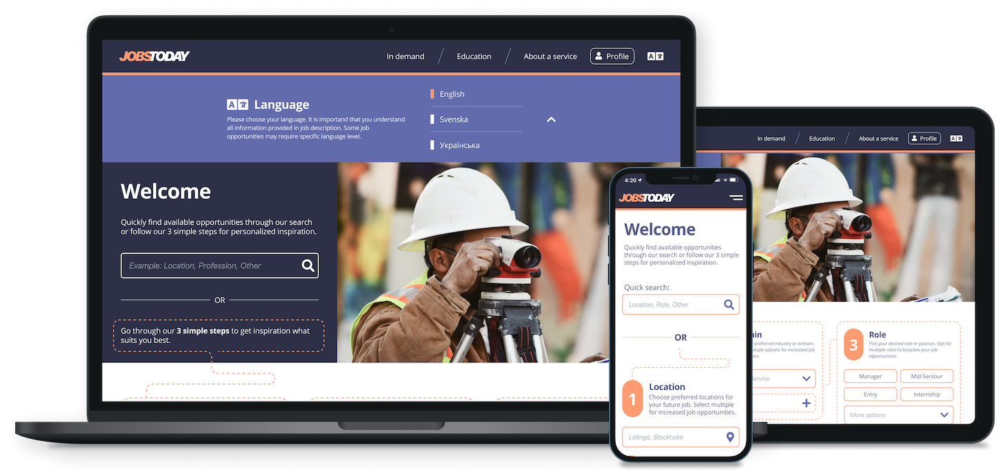
Drawing from insights gathered during usability studies, I implemented design changes, such as introducing a Quick Search feature as the primary option
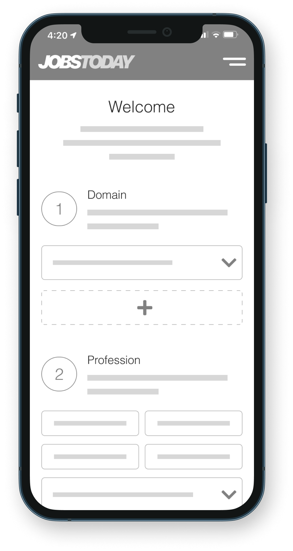
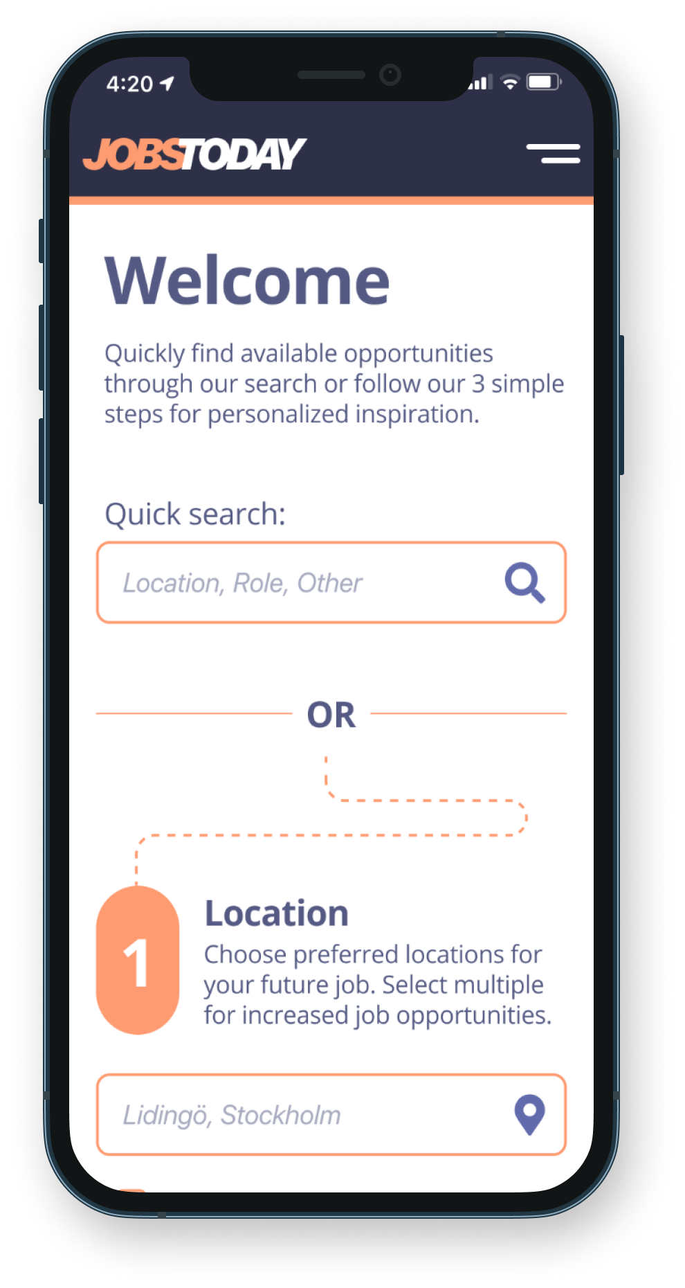
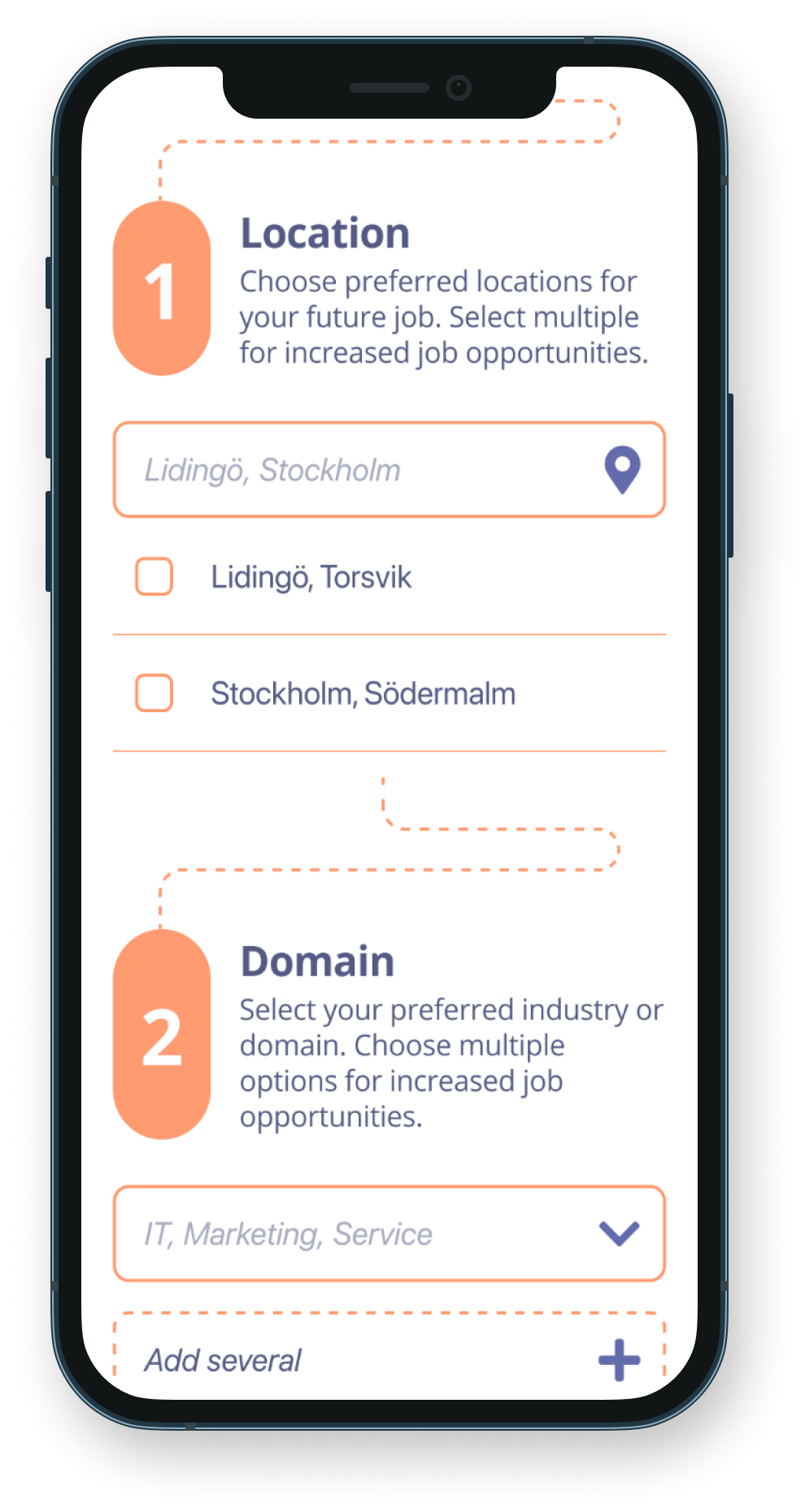
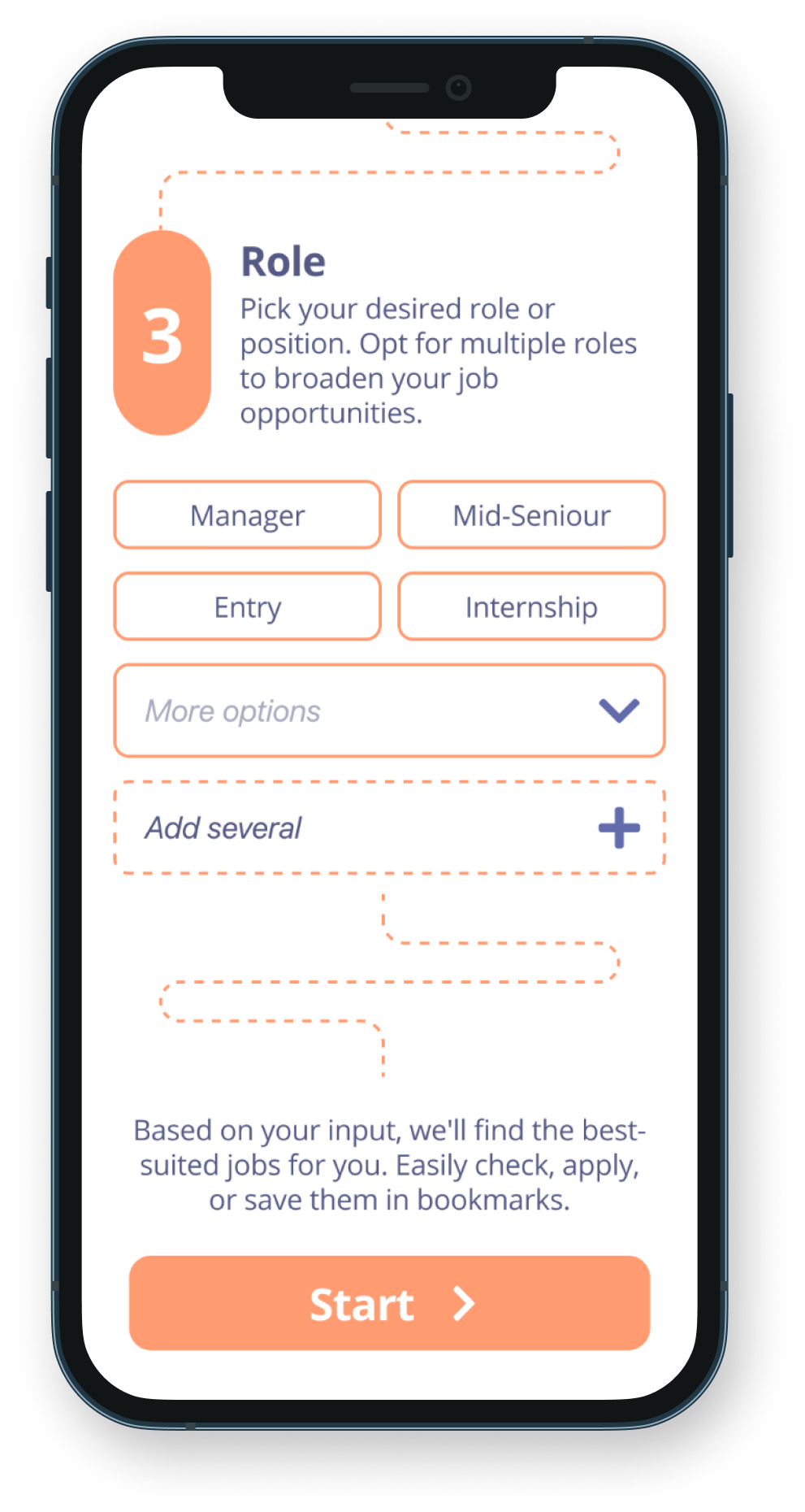
Additional design changes involved reordering the steps, making 'Location' the first step, followed by 'Domain,' and then 'Role,' instead of 'Profession'
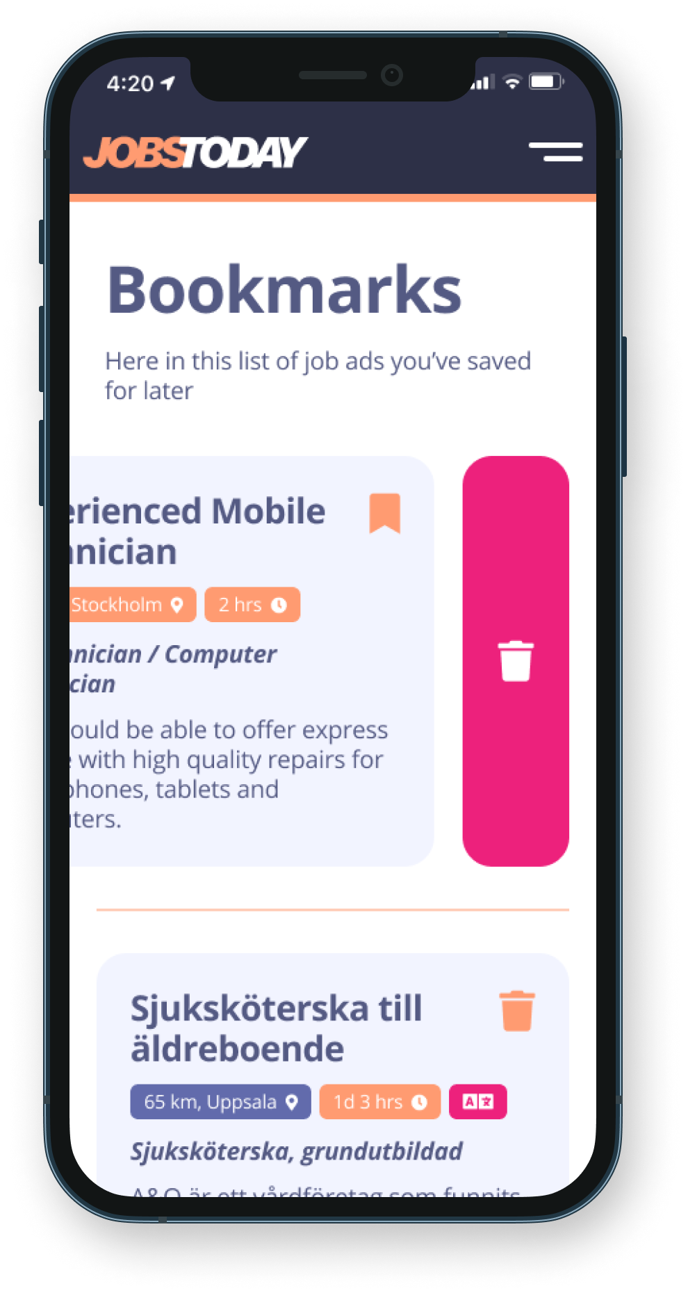
Another design change involved relocating the Bookmarks section to a dedicated page, separate from the Profile page
The high-fidelity prototype followed the same user flow as the low-fidelity version, incorporating design changes implemented after the usability study.
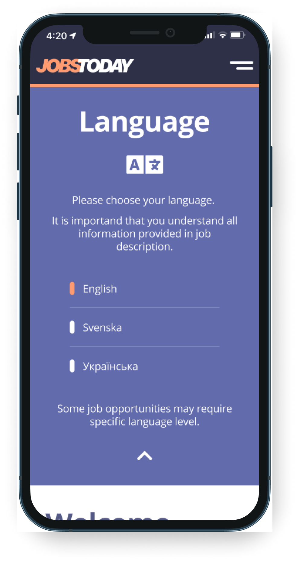
Hi-fi prototype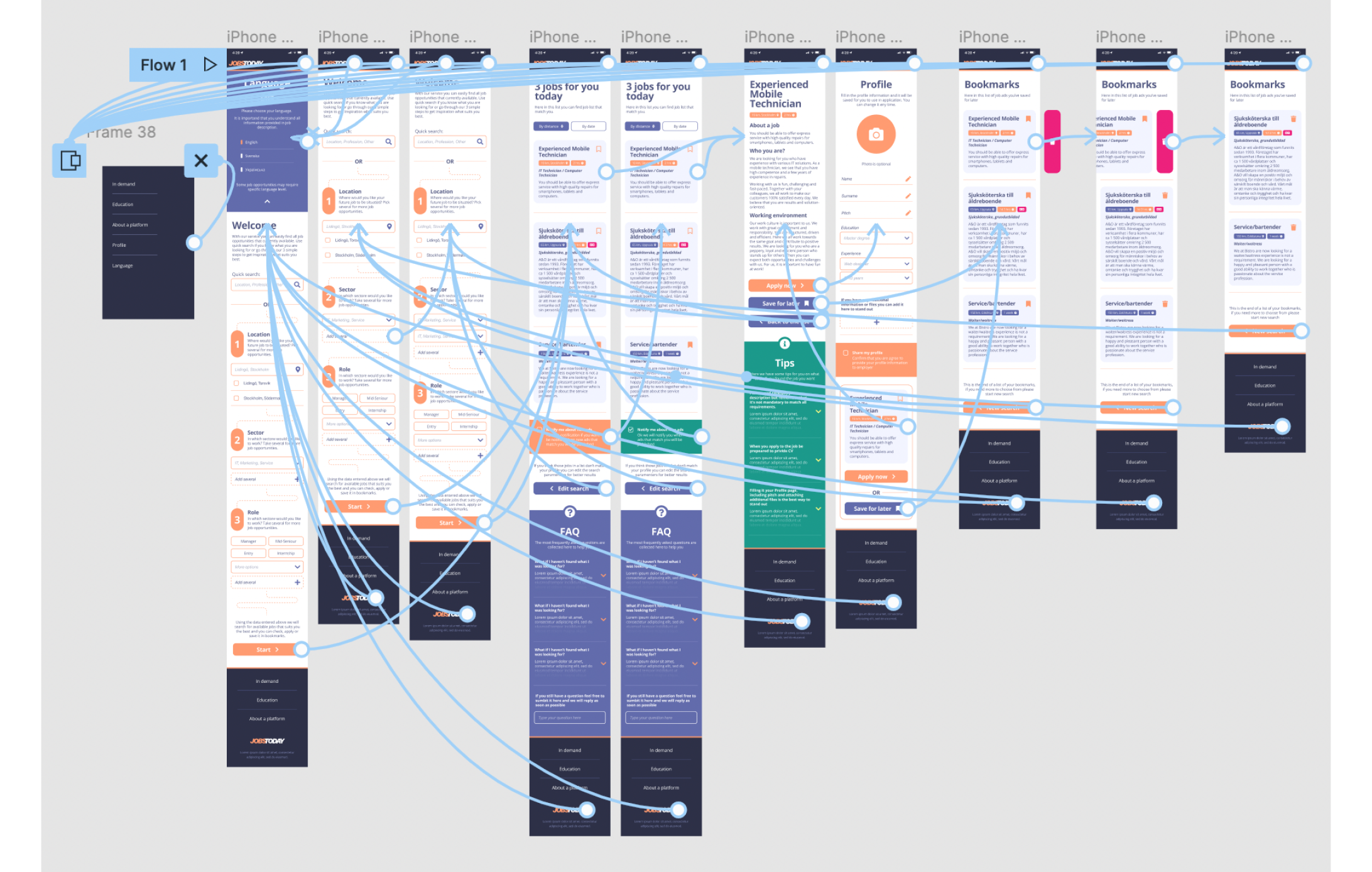
Ensure clear labels for interactive elements that are accessible to screen readers
Support for multiple languages with a focus on first-generation immigrants
I incorporated alt text on every page for seamless screen reader access in the site design
I accounted for various screen sizes in my mockups, building on earlier wireframes. While the primary emphasis is on the mobile platform, users will access the app from diverse devices. Optimizing the browsing experience for a range of sizes, including mobile and tablet, is crucial, especially since the app may be used in help centers for other courses catering to first-generation immigrants.
Our target users shared that the design was intuitive to navigate through, more engaging with the images, and demonstrated a clear visual hierarchy.
I learned that even a small design change can have a huge impact on the user experience. The most important takeaway for me is to always focus on the real needs of the user when coming up with design ideas and solutions.
Conduct follow-up usability testing on the new website
Identify any additional areas of need and ideate on new features
Thank you!