Explore the art gallery at your own pace. This app allows visitors to navigate the exhibition individually, without the need for a group, ensuring an uninterrupted experience at their convenience.
Visitors prefer a seamless experience without waiting for group tours to start. They want to fully enjoy the exhibition at their own pace, absorbing as much information as possible without any time constraints.
Design an audio tour app for an art gallery, empowering users to relish the exhibition at their leisure, accessing a wealth of information without being bound by a fixed schedule.
UX designer (generalist) designing an app from conception to delivery
Conducting interviews, paper and digital wireframing, low and high fidelity prototyping, conducting usability studies, accounting for accessibility, and iterating on design
The research revealed a primary user group: students and working adults who, in their free time, either have a strong interest in or actively study art. This finding validated assumptions about the main user demographic for the app.
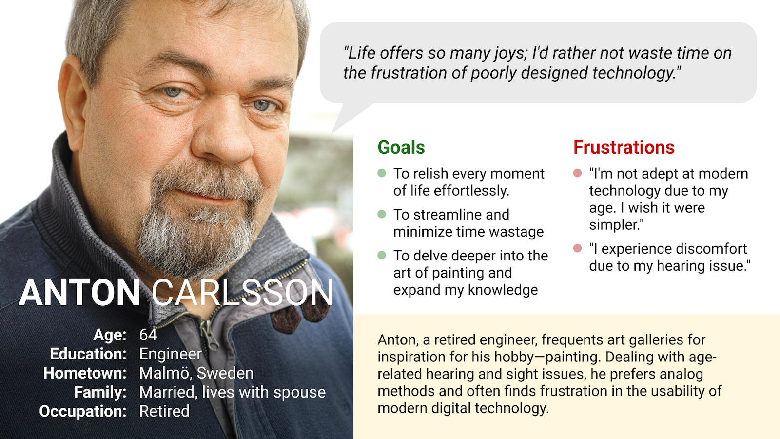
Furthermore, another noteworthy user group identified in the research comprises retired individuals dealing with hearing and sight issues. Remarkably, this demographic represents a common segment of museum and art gallery visitors in Europe.
People often visit galleries independently due to time constraints or spontaneous sightseeing.
Many visitors dislike sharing headphones in museums or galleries, prompting them to either skip the experience or become frustrated.
Elderly individuals with sight and hearing issues may feel discomfort when asking for information to be repeated.
Scheduled groups often compel visitors to move forward, whereas many would prefer to linger longer near different objects.
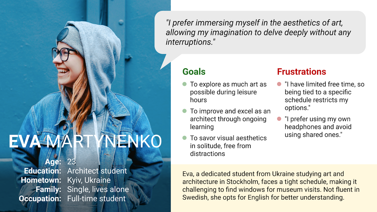
Eva, a student with a busy schedule, seeks an uninterrupted and convenient time to study art.
Anton, a retired engineer, seeks to enjoy art and gather information without frustration, as he often misses details due to a hearing issue.
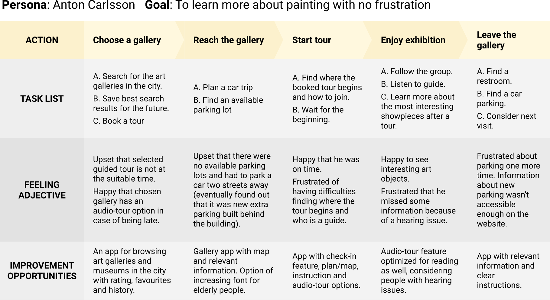
Analyzing Anton's user journey highlighted the potential benefits of providing users with a dedicated Art Gallery app.
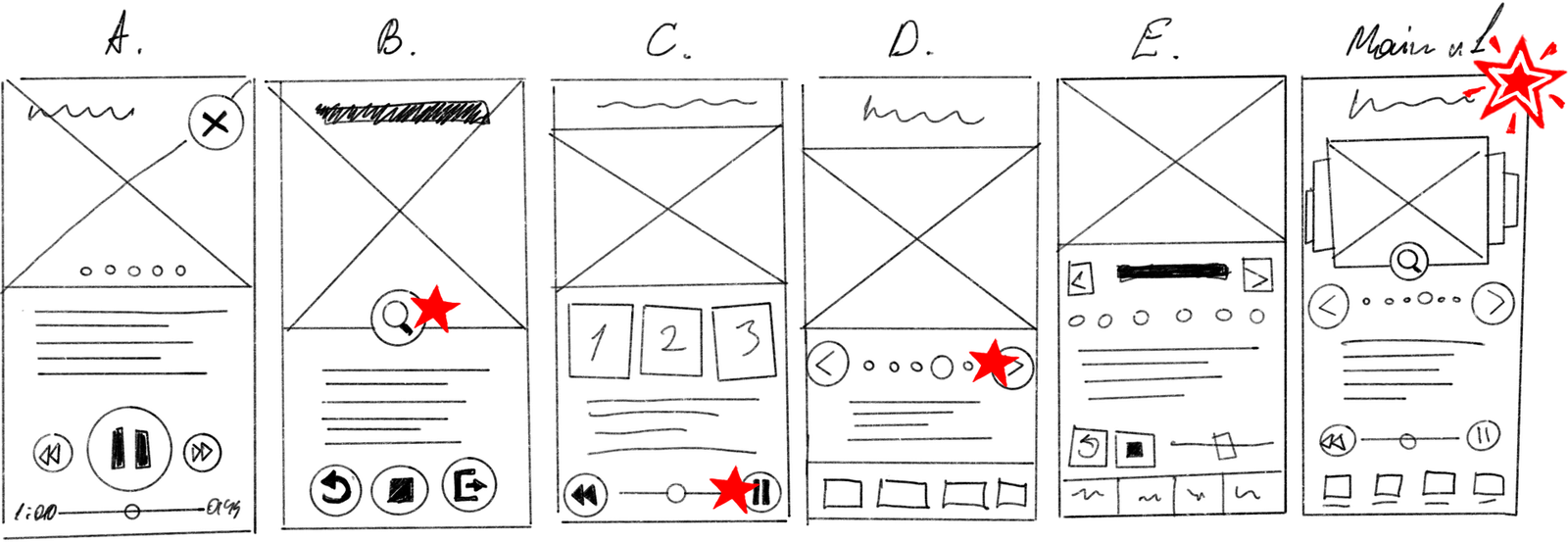
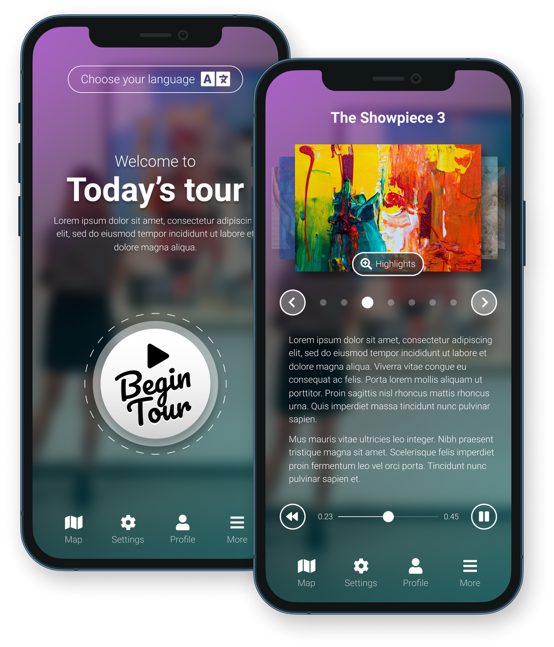
Taking time to draft iterations of each screen of the app on paper ensured that the elements that made it to digital wireframe would be well-suited to address user pain points. For the main screen I've prioritized intuitive playback controls and attractive carousel interaction.
Throughout the initial design phase, I prioritized incorporating screen designs based on user research feedback and findings.
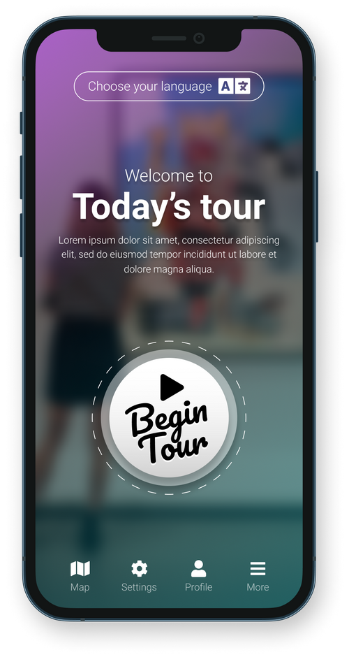
This prominent and appealing button provides users with a clear indication that starting the tour is easy and quick, without unnecessary extra steps.
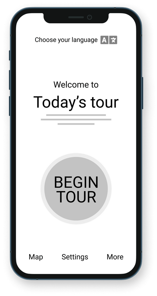
At the top of the screen, positioned before anything else, there is a language selection button - a convenient starting point, especially for non-local users.
Easy navigation was a key user need to address in the design in addition to equipping the app to work with assistive technologies.
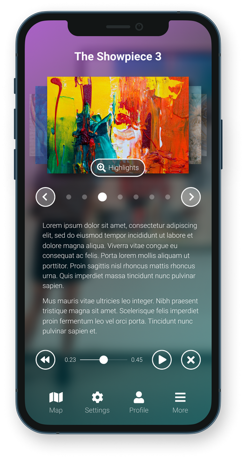
Simple and transparent pagination at the center of the screen facilitates progress tracking and content navigation
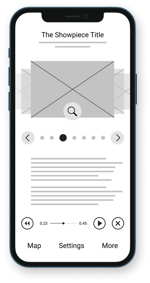
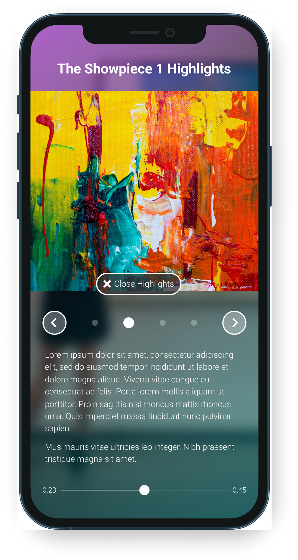
The 'Highlights' button is conveniently placed directly on the piece thumbnail, ensuring easy access by making the entire thumbnail clickable
Interactive playback controls are designed to minimize clutter — the "close" and "play" buttons only appear after activating the "pause" function
The low-fidelity prototype seamlessly integrated the primary user flow, covering the initiation of the tour and playback navigation. This allowed the prototype to be effectively employed in usability studies with users.
Lo-fi prototype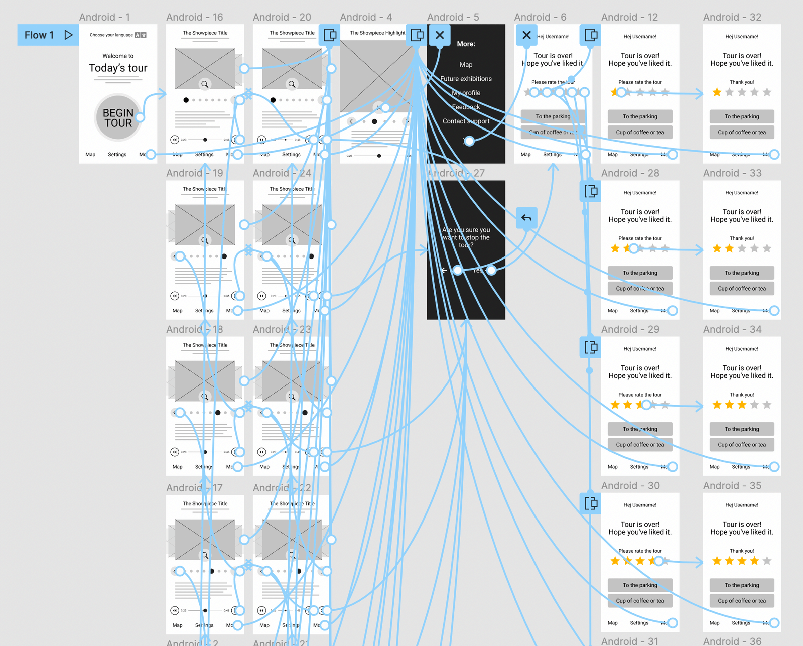
I conducted two rounds of usability study. Findings from the first study helped guide the design from wireframes to mockups. The second study used a high-fidelity prototype and revealed what aspects of the mockups needed refining.
User wants to start tour quickly
User wants to have playback controls
User wants to choose language
User wants to have text on “Highlights” button
User wants main menu to look more like a buttons
Following the usability studies, I've put language options at the top and relocated registration and login functionalities to the main menu.
In the second usability study, it became evident that relying solely on an icon for the "Highlights" button wasn't sufficient. Consequently, I added descriptive text alongside an enhanced icon to address this feedback.
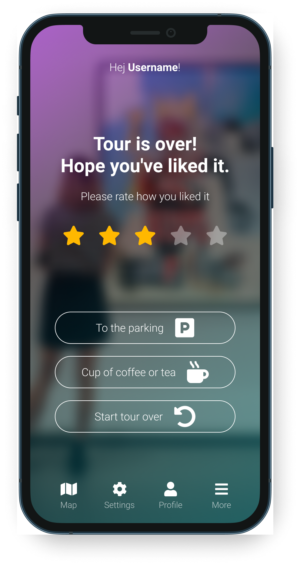
The final high-fidelity prototype showcased streamlined user flows for audio tours. It effectively addressed user needs by incorporating playback control options, integrating buttons into the main menu, and including a rating feature at the conclusion.
Hi-fi prototype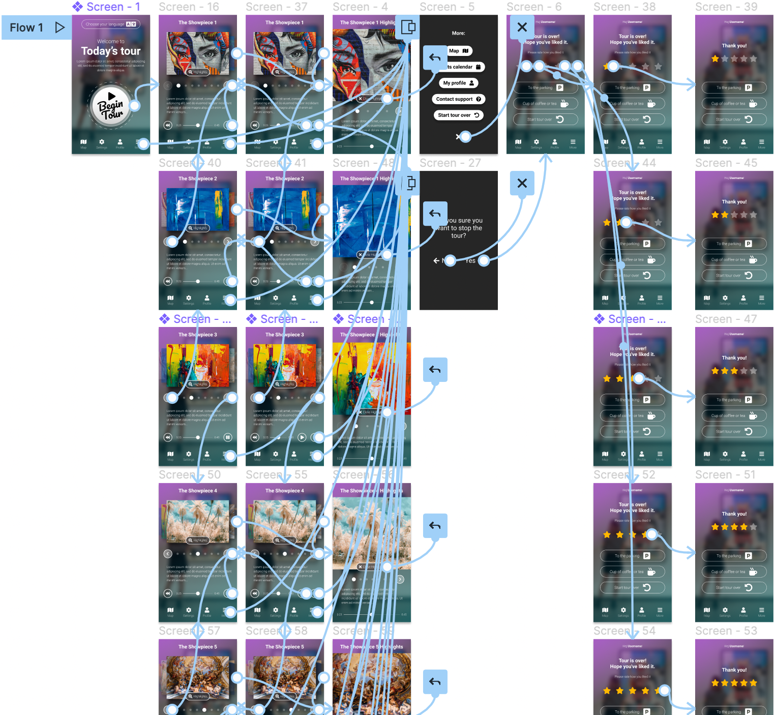
Provided possibility to choose languge at the beggining of the tour
Utilized detailed imagery for showpieces to assist users in obtaining relevant information
Employed a combination of icons and text to enhance navigation simplicity
The app offers visitors the opportunity to effortlessly take a tour, allowing them to focus solely on the showpieces and trust in gallery services.
One quote from study participant: “Brilliant! I wish all galleries and museums had something like this”
During the design of the Audio-tour app, I discovered that the initial ideas were just the starting point of the process. Usability studies and feedback from peers played a pivotal role in shaping each iteration of the app's design.
Conduct another round of usability studies to validate wether the pain points users experienced have beed effectively addressed
Conduct more user research to determine any new areas of need
Thank you!